CVS Health - UX Global Navigation Strategy
CVS.com Navigation

A Scalable Solution for Navigation
Enabling pathways for healthier outcomes
Introduction
In 2021, CVS Health decided to shift their attention away from a singular focus on the strength of the business (pharmacy) to one that would holistically encompass all of its parts and, in doing so, highlight recent acquisitions and emphasize the growing expertise of their health solutions portfolio. As a component to this, they would need to introduce a reimagined solution for global navigation on CVS.com that could scale to serve those needs while ensuring high levels of usability, and WCAG 2.1 AAA levels of accessibility.

Business insights with a lens towards traffic
The UX strategy team would assume that task to outline a high-level, visionary, and directional global navigation design. With project kickoff in mid-January 2022 and a March / April 2022 timeline, the team would need to work quickly. The following case study highlights the outcomes and efforts of that work.

CVS saw the repositioning of the brand as a health and wellness company through two major initiatives; site redesign and global navigation updates. Site redesign work would encompass content and layout from the positioning of elements on the home page and the layout, modernizing and accounting for greater balance between the needs of their customers and those of the business segments. For my team and I, our focus would be on the global navigation initiative.
With the high-level goal in mind, I sat down with my colleagues on the UX strategy team to formulate an actionable plan for “how” we would get there, “what” we were going to solve for, and “why” it mattered through the lens of user experience.
Problem statement (high-level)
Elevate the CVS.com experience to reposition it as a leader in health and wellness.
Strategy

The double diamond process
The planning and strategy for this work came together with the double diamond framework in mind. Leveraging this framework would provide a structure for the approach in uncovering problems and solutions.
The first diamond would focus on the strategic and foundational aspects of the work. We would start broad (diverge) in the discovery phase to enable creative collaboration and key in on the knowns and unknowns. The information that we would gather here would provide the insights that we would need to narrow in (converge) on the definition of our problem.
Once the problem was defined, the second diamond would place the focus on the solution and diverge in the ideation of concepts, prototypes and testing to converge and deliver on a solution.
This framework would help myself and the team map out and structure the opportunity space and select which opportunities to pursue.
Phase: Discover
As the team considered this work (prior to kickoff), the team would create and schedule a workshop with key members of the strategy group and research teams with the intent of alignment across teams.

Workshop in Miro to collaboratively align on approach
Guiding principles would provide the North Star:
Simplicity
Clear pathways for customers to find the products, services, and information they need when they need it.
Reprioritize how the site is organized, moving from a business-led approach to customer-centricity.
Improve wayfinding for customers completing tasks across CVS.com by creating consistent navigation patterns.
Humanity
CVS cares for the whole person, supporting customers to move from condition diagnosis to condition management.
Be thoughtful about how we raise information, to whom, and in what context.
The experience design (navigation and landing pages) must be clear and accessible, and have the customer’s best interests at heart.
Relevancy
We must move toward personalization by tailoring experiences to meet individual customers where they are.
We need to create a site experience that raises pertinent, high level next best actions (NBA) that parallel homepage designs.
We won’t settle for “one-size-fits-all” experiences. The experience may change depending on the customer’s level of engagement with CVS.
Problem Exploration
Going deeper into the problem. It is here that we try to learn and understand more about the problem that we are trying to solve.
Questions for exploration:
What is driving the need for the redesign?
Are we solving for the right problem?

The current (as of Q4 2021) desktop experience for navigation on CVS.com (top level categories highlighted)
Upon my examination the site was found to use a federated model for site navigation. This meant that each primary top-level category represented a different business unit on the site. While this worked in terms of segmentation for the business (each unit would own the experience for their page), from the standpoint of usability, it was problematic in the way that customers would navigate the site.
Identified points of friction -
Inconsistent navigation leads to higher levels of cognitive load.
Top and sub-level categories would change whenever a customer visited another top-level landing page.
Navigating to and surfacing sub-level pages required clicking/tapping on the requisite top-level category.
Not only would a customer need to know where to look, they would have spent time navigating between the top-level pages to get to it.
Key metric -
Nearly 88% of the traffic to CVS.com was through the side door
Foundational Research
I would examine the current site structure (sitemap) to form a baseline for future testing. Upcoming services, later identified in my conversations with various business units, would be highlighted in yellow and broken links would be marked in red.

Site map for the unauthenticated experience
I would also consider prior design work and ancillary research by the Baymard Institute for different perspectives and to understand from the past.
User Journey
The customer journey would place the focus of our work on two customer segments and highlight areas of opportunity (points of friction) for each. Narratives, created for each segment, would center the conversation around needs, tasks and task completion (via jobs-to-be-done theory) and the theme of health and wellness.

Project timeline
Several tracks highlight the work that was being done and the stage that we were in in exploration over a 3 month period.

Project timeline
Phase: Define
At this point, the work, that had begun in the discover phase, was converging into tangible outcomes.
A synthesis of the research led to a strategy that would explore a new navigation paradigm and a move away from a top-level focused navigation.
We had identified the actors for our primary customer archetypes for Sophia and Michael
Product requirements were solidified
Responsive
Inclusive of top and sub-level categories for ease of navigation
Omnipresent navigation pattern with consistency in expectations for interactions
Next best action module for guidance
Need for points-of-view on different types of navigation (federated, centralized, and hybrid)
Accessible and fully WCAG 2.1 AAA compliant
How might we…
Drive deeper levels of personalization?
Drive greater adoption and use of the site navigation?
Drive task completion in creating categories that are easily understood?
Phase: Develop
As we pivoted to the second diamond, we would begin to place our efforts on concepting, testing and execution.
Concept exploration
I would create wireframes and prototypes in Figma of various concepts help the team consider and visualize the new navigation structure, sub-navigation patterns and interactions. In combining user flows and wireframes, a more complete picture of each concept emerged and saved time.
Navigation models

Early wireframes for a federated (v1) version of the global nav that would shift depending on the portfolio (pharmacy, shop, MinuteClinic, etc)
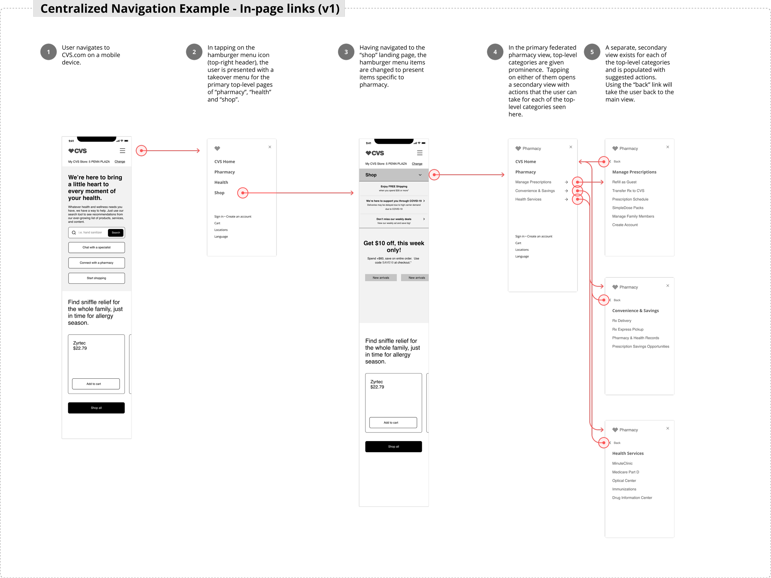
Early wireframes for a centralized (v1) version of the global nav that would focus on a consistent global nav and page specific nav elements

Conceptual work that I did to show a completely different way of approaching the global nav from the perspective of a hybrid centralized approach with landing page content (in-house from their network of pharmacists and clinicians) that would elevate CVS as a leader in health and wellness.
Navigation patterns
Once we had decided on a centralized navigation model, I would move to medium to high fidelity comps and prototypes for user testing navigation interactions and variations on nomenclature for validation.

Takeover with accordion interaction

Side navigation with progressive disclosure

Takeover with dropdown animation and progressive disclosure

Desktop view of a mega menu drawer (from top) for the top-level category of “prescriptions”
Responsive web Figma prototype: https://www.figma.com/proto/oYKFOE2vhzSfd4uj4nXi19/Navigation-UI?page-id=2%3A53348&node-id=2%3A54193&viewport=2086%2C617%2C0.5&scaling=scale-down&starting-point-node-id=2%3A54193
Desktop experience Figma prototype: https://www.figma.com/proto/oYKFOE2vhzSfd4uj4nXi19/Navigation-UI?page-id=2%3A76687&node-id=2%3A76797&viewport=1164%2C2742%2C0.5&scaling=contain&starting-point-node-id=2%3A76797
Accessibility
User Testing
As we began to narrow our options for high-fidelity concepts, in parallel, I would collaborate with our in-house research team to test nomenclature improvements and wayfinding for task completion.
Navigation Tree
Unmoderated, remote user research method intended to access findability for a given web hierarchy (tree). It helps to reveal issues related to the hierarchical category structure and category levels.

Current navigation hierarchy versus new
Hypothesis: Users will be able to quickly find and locate products and services under the newly revised navigation structure
Method: tree testing through OptimalWorkshop
Participants: screened and recruited through User Testing
I wanted us to lean into task completion for this test.
Task 1: You want to schedule an appointment to get tested for COVID-19.
Task 2: You want to schedule a flu shot for you and your family.
Task 3: You want to move your current prescriptions from Walgreens to CVS because it’s more convenient for pickup.
Task 4: You are feeling sick and would like to buy over the counter flu medicine.
Task 5: You have a history of depression and have been feeling down lately. You would like to schedule a screening with a provider.
Task 6: You are running low on contacts and need to order more.
Task 7: You want to enroll in the CVS loyalty program in order to save money on your purchases.
Task 8: You want to order 4x6 photo prints from your recent vacation.
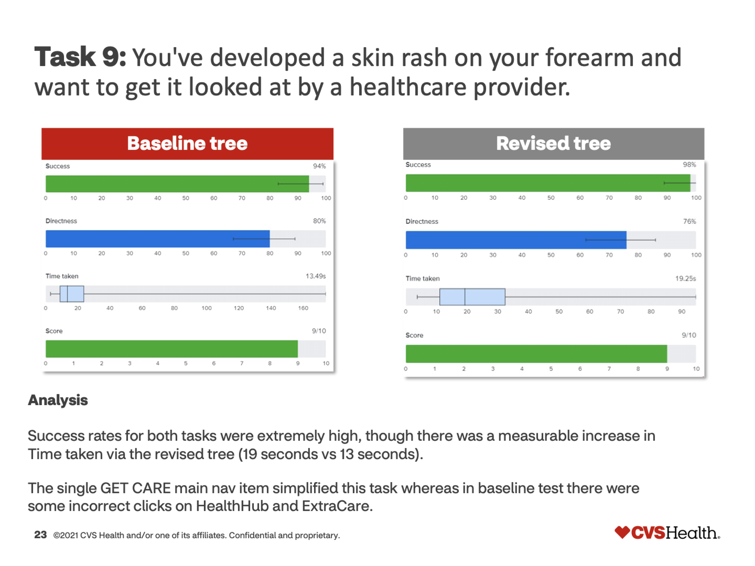
Task 9: You have developed a skin rash on your forearm and want to get it looked at by a healthcare provider.
Summary -
Results showed that our new organization to simplify our top-level categories resonated with users both in terms of findability and task completion.
Positives
Participants were able to successfully locate MinuteClinic and HealthHUB under the newly created category
Participants were successful in easily locating Photo underneath Shop Products despite it no longer being a top-level category
Negatives
Participants had much more trouble locating Optical underneath Shop Products
Key outcomes with the revised navigation:
A higher percentage of participants (94% versus 75%) noted that finding items was either easy or somewhat easy
Scheduling a COVID-19 test and enrolling in the loyalty program were much easier tasks for participants
Participants noted that, generally, it was, “Very easy tree to follow and find the target.”
Key revisions:
Shop Products would change to “Shop” to be more inclusive of products and services.
End Results
The results of our initial strategic vision which placed a focus on our principles of greater simplicity, clarity, and relevancy. As I collaborated with our UXR and accessibility teams, changes and compromise to the overall design was expected - some of that reasoning is called out below. The end result was a navigation that prioritized our principles and the main focus of the navigation which was to facilitate the completion of goals (JTBD).
Navigation -
Accessibility
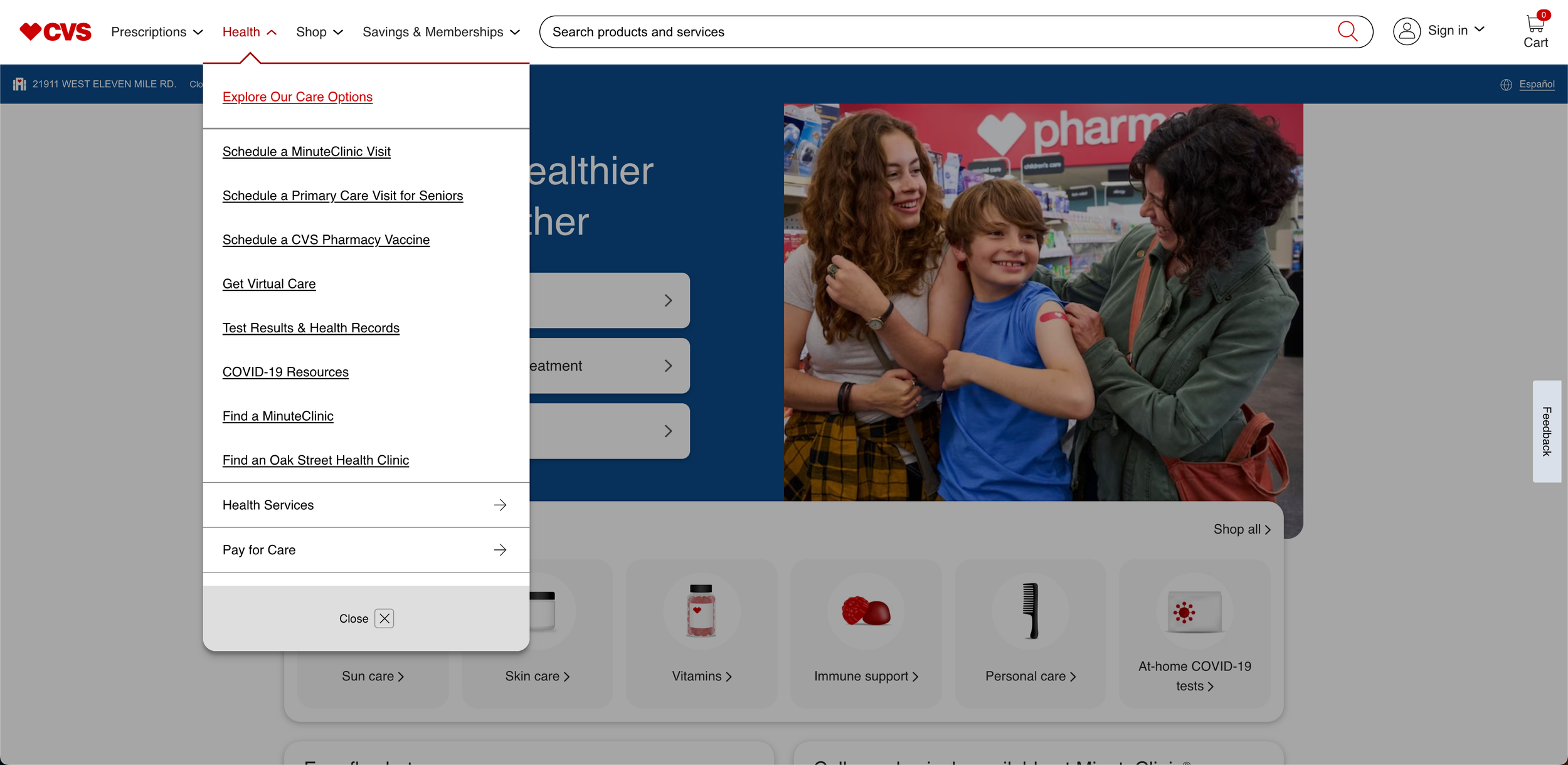
Keyboard enabled tab navigation for increased ease and focus
Underlines to ensure visibility for all links in the navigation
Navigation Research
Much of this work was done in parallel to our strategy work and was reflected in the structure that is shown
Make apparent the “home” page for that category (for prescriptions that meant providing a link back to the “Pharmacy Home” page)
Lean into task completion and highlight areas of services, savings (retail), health information and related services.
Navigating the menu
Leverage patterns such as the back button to enable navigation through multiple levels of navigation removing the need to take up additional space and extend the dropdown with fly-out menus.
Physical store -
As a company that is proud of their presence in local communities, we wanted to highlight their local store information; store hours, services offered, and location.

The current desktop view



Additional Impact Considerations

Traffic to CVS.com continues on a strong trajectory with increases in direct traffic average and slight upticks in pages per visit and average site duration

Sidedoor traffic has decreased with the recent redesigns of the global navigation and landing pages.


