CVS Health - UX Native App Strategy
CVS

Providing support when you need it
Perspectives and strategies on the CVS Health constellation of native apps.
Project Overview
Goal -
Evaluate native apps across the CVS Health native app constellation with a lens towards strategy
Problem Statement -
From a strategic standpoint, how might we gain a better understanding of how/when/where customers are using CVS Health apps and what are those potential moments of need.

The CVS Health app constellation (first party and third party)
Project Responsibilities
As the Senior UI Designer on a CVS strategy team, I was asked to cast a wide net in considering all of the native apps in the CVS Health ecosystem. The scope of the ask from my manager was enormous and the timeline was aggressive. Knowing this, I would strategize on a plan on how best to communicate the overall story while creating a task list, for myself, to achieve the desired result.
Tasks -
Take inventory of all of the associated apps that I could find and understand each at a high-level around purpose/goals.
Consider all of the research available to us.
CHO deck - Jobs related to keeping their family healthy
UXR deck - Jobs to be Done
Create a narrative, based on research, for different persona types.
Map customer journeys with inputs from research and knowledge of the JTBD framework
Consider points of friction as areas of opportunity
Make recommendations
Timeline
For this exploratory strategic effort, timeline was not a concern. I would time-box the work to about 2 weeks, offering my manager a level of expectation for when the work could be completed and shared out.
Design Process

Discovery -
In order to understand the breadth of the native app ecosystem, I needed to understand what was out there. I’d meet with my manager to discuss what these were and from those discussions, we would focus on the following.

Sleepio
An app that encourages better sleep through clinically proven cognitive and behavioral techniques.

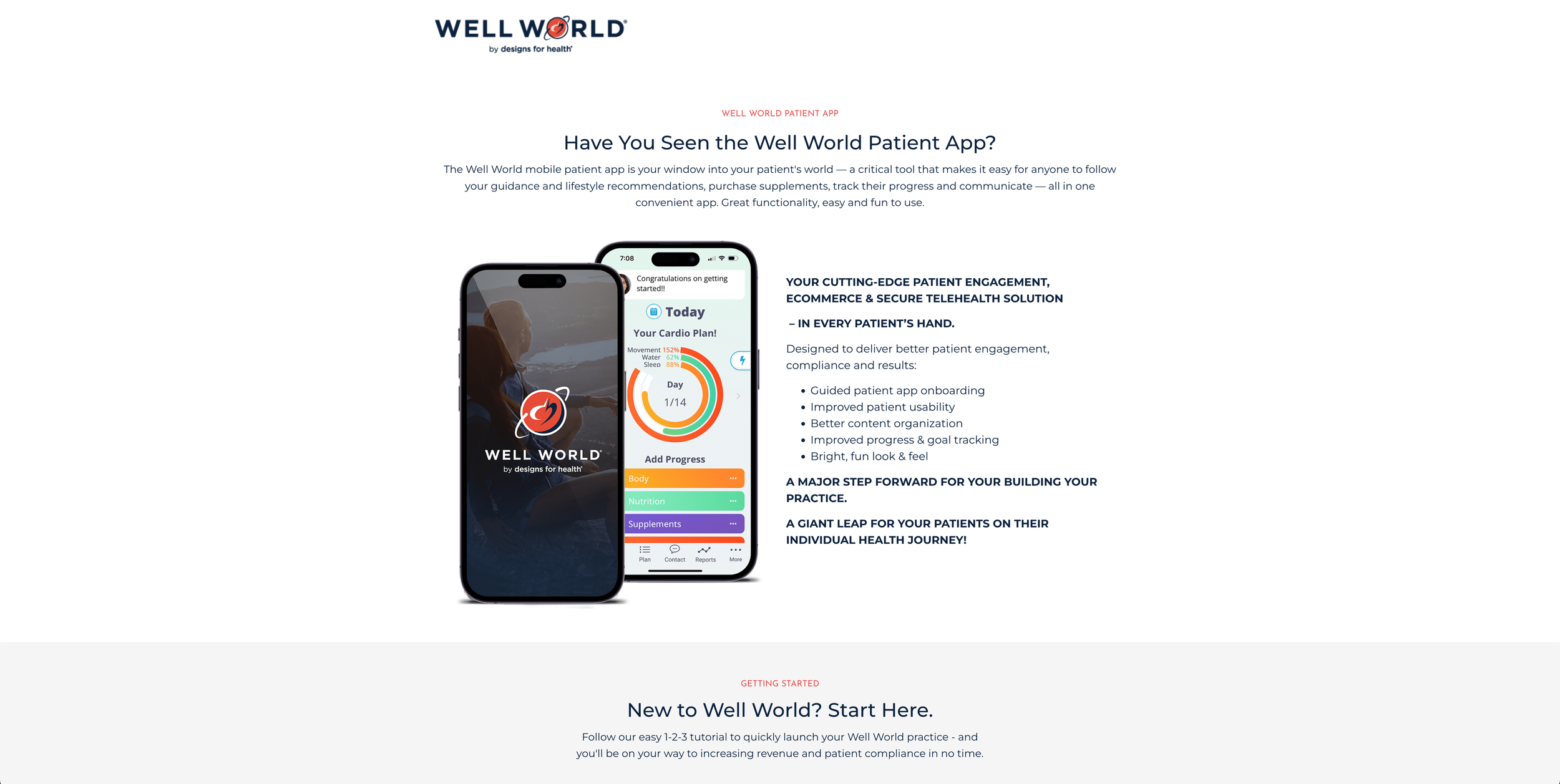
Well World
A tool that makes it easy to follow guidance and lifestyle recommendations, purchase supplements, and track progress and communications.

CVS
An extension of CVS pharmacies, the app focuses on retail in the health space; offering quick access to ExtraCare and rewards. Customers can also view and take action on medications, schedule immunizations and more.

Aetna
Quickly access, view, and manage your health insurance, by Aetna, benefits

Epic
A comprehensive view of your health records all in one place.

Attain
Attain by Aetna® is the app that helps you follow your own path to better health. It takes your unique health history, combines it with your wearable device activity, and offers you personalized challenges and goals and motivating rewards.
Research -
Having gained an understanding of the ecosystem, the goals for each app and their features, I would begin to look to direct and indirect competitors in the native app space. Key to this exercise were the strategies that were employed by these companies to create and maintain a single app or keep their experiences distinct and what, if any, features would be pulled into another for greater synergy.
Competitive analysis
We were familiar and had experienced great experiences from other companies. So we wanted to understand a bit more their strategies. What worked for them and why and how their models were different. To provide these perspectives to our stakeholders, I’d create communicate this research to stakeholders through the following slides.
Oscar, a direct competitor in the health space, for health insurance utilizes a single app strategy that incorporates many useful features like managing your insurance plan, communicating with your primary care physician/team, prescriptions and health records into a single native app experience. Metrics provided valuable insights for our stakeholders to consider around several key KPIs for engagement and trust.

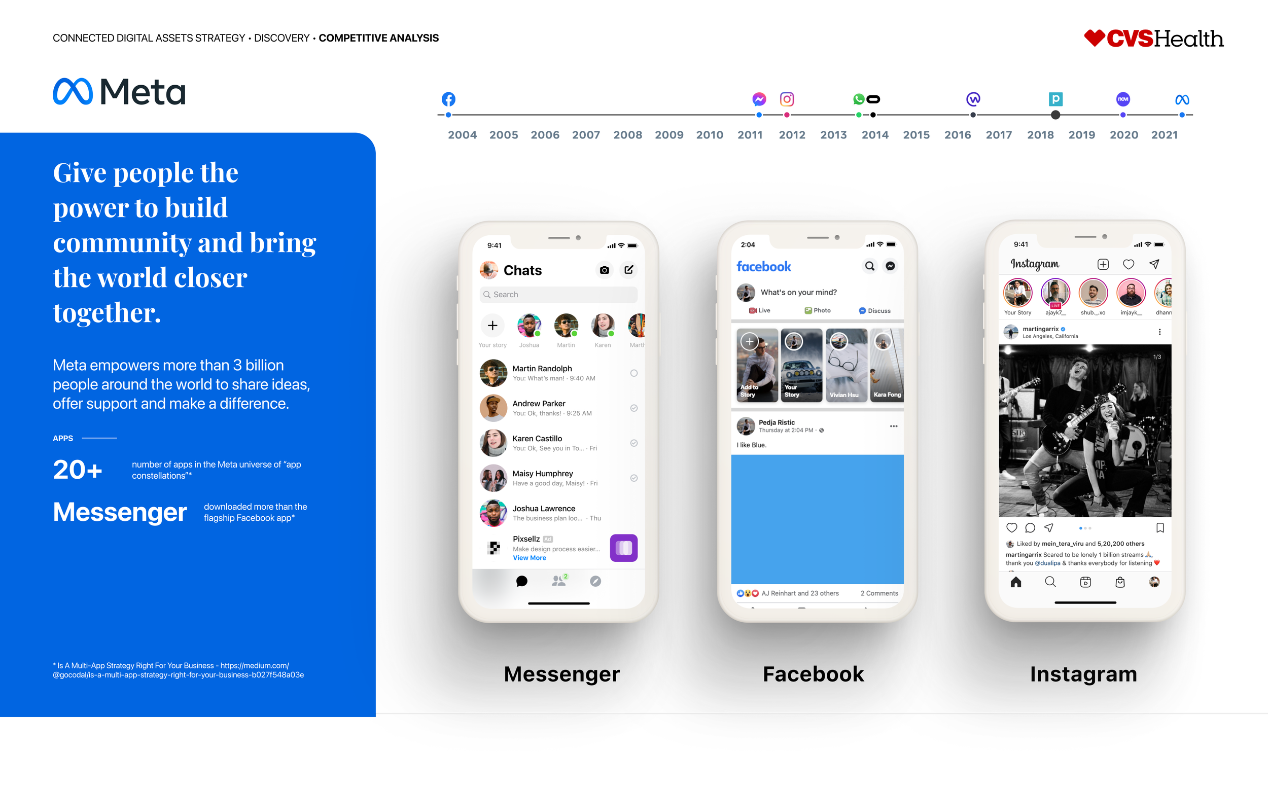
Meta, the owners of Messenger, Facebook, and Instagram (and others), leveraged a multi-app strategy. They would do so, however, in a way that would carry over certain features, such as messsaging, across platforms to create a more unified experience. The Messenger app would be retired with its features being tightly integrated into Facebook and Instagram experience.

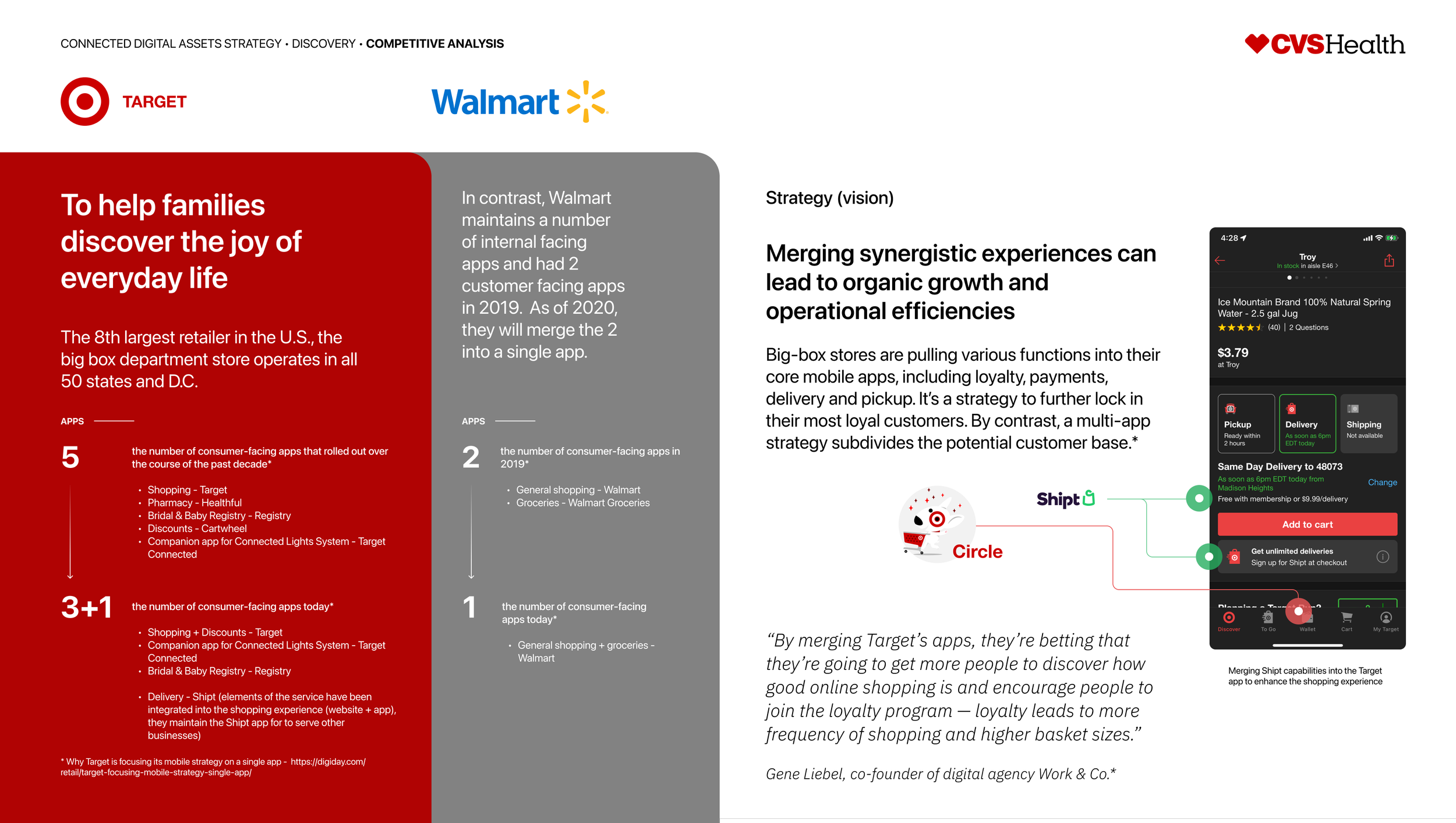
Turning to the retail space, an important component of the CVS experience, I focused on Target and Walmart to better understand their strategies for their native apps and, in particular, the features and integration strategies they would deploy. Target, for example, consolidated their constellation of native apps from 5 to 3+1 (Shipt would be acquired for their expertise in delivery) experience while understanding the value of incorporating features from other owned experiences to 1). elevate the checkout experience in main app and 2). create additional opportunities for growth (Shipt service).
Task analysis
As I considered user needs for when/where/how CVS apps would be used, I needed to begin to map out their journeys as it related to tasks or jobs to be done. For the uninitiated, JTBD (Harvard Business Review - Know Your Customers’ “Jobs to Be Done”) refers to the need an individual or group has at any given moment to “hire” a product or service to help them complete a task. This is an important distinction. Knowing the “why” helps us understand need in the moment.
Needs in focus (themes) -
Convenience - meet me where I am and lean into my preference(s) for interaction and personalization
Trust - prove your credibility and expertise through the experiences that you provide
Flexibility - adapt to the constantly shifting priorities in my life
Outreach - be proactive in understanding my health needs
Education - give me the information that I need when I need it to make an informed decision
Design
Layout
For layout, I wanted to simply tell the story for our actors, Sophia - the CEO of her family and Michael - a healthy individual who’s less focused on their long-term health, in a way that the audience could empathize with in highlighting their day-to-day scenarios. Phases would help us understand where they were for any given moment in their customer journeys and a timeline would support the narrative to reveal critical moments of need in the context of jobs to be done.
Narrative

Meet Sophia
As the CEO of her family, Sophia looks to experiences that can “collaborate” with her on a daily basis in caring for her family.
Her consumer values and behaviors profile as that of an “explorer” and “soldier”. Someone who is on a budget and seeks out value and credible information to make informed health decisions for her family.

Meet Michael
As someone who does not have the responsibility of raising a family, Michael is much more focused on his own wellbeing.
His youth elevates his sense of security and leads him to be a bit more reactive versus pro-active as it relates to managing his health.
Customer Journey
The customer journey for the connected digital asset strategy
In addition to the customer journey, I included a section for “other considerations” to highlight verticals, front-door and “wellness app”, that could be candidates for potential solutions for a consolidation strategy. Below is a sampling of that conceptual work.
Wellness app concept
The “wellness app” concept explored the feasibility of incorporating features from different experiences into a single app.