Future State - AI Design
Client project to examine a potential future state

AI Design
How might we make conversational AI easier to consume and navigate?
Summary
With the introduction of AI and the growing adoption of its usage as a primary interaction model, I worked with a small team of proprietors in exploring the limits of AI-based solution for early childhood activities to bring about a potential future state experience that aims to remove friction by way of a hybrid conversational interaction model.
Problem Identification

Turn-based Conversation UI
An example of a typical chatbot interaction
Up until this point, AI interface design has, largely, followed the path of least resistance. Interactions center around turn-based conversation loops. It is a pattern that we have all grown accustomed to, as seen through various chatbots throughout the web. And while this method of communication works for the intended purpose of quick rapid-fire responses, it does not offer much in the way of guidance. This is especially problematic in the space of AI where the response is only as good as the user crafting the prompt (input) as illustrated in the example below.

How might we simply an AI prompt? Example from https://wattenberger.com/thoughts/boo-chatbots
Solution
Offer users a hybrid model for AI interactions based on the following guiding principles.
Preference - offers users the ability to interact with the AI using their preferred method of interaction.
Comfortability (ease of use) - while conversation UI is familiar, the interaction with AI and the reliance on prompts to facilitate those conversations can be challenging for users unfamiliar in framing them to get to the desired outcome.
Affordances - text inputs lack affordances offered by traditional UI. “Good tools make it clear how they should be used. And more importantly, how they should not be used.” -Amelia Wattenberger
Screens

Start up screen
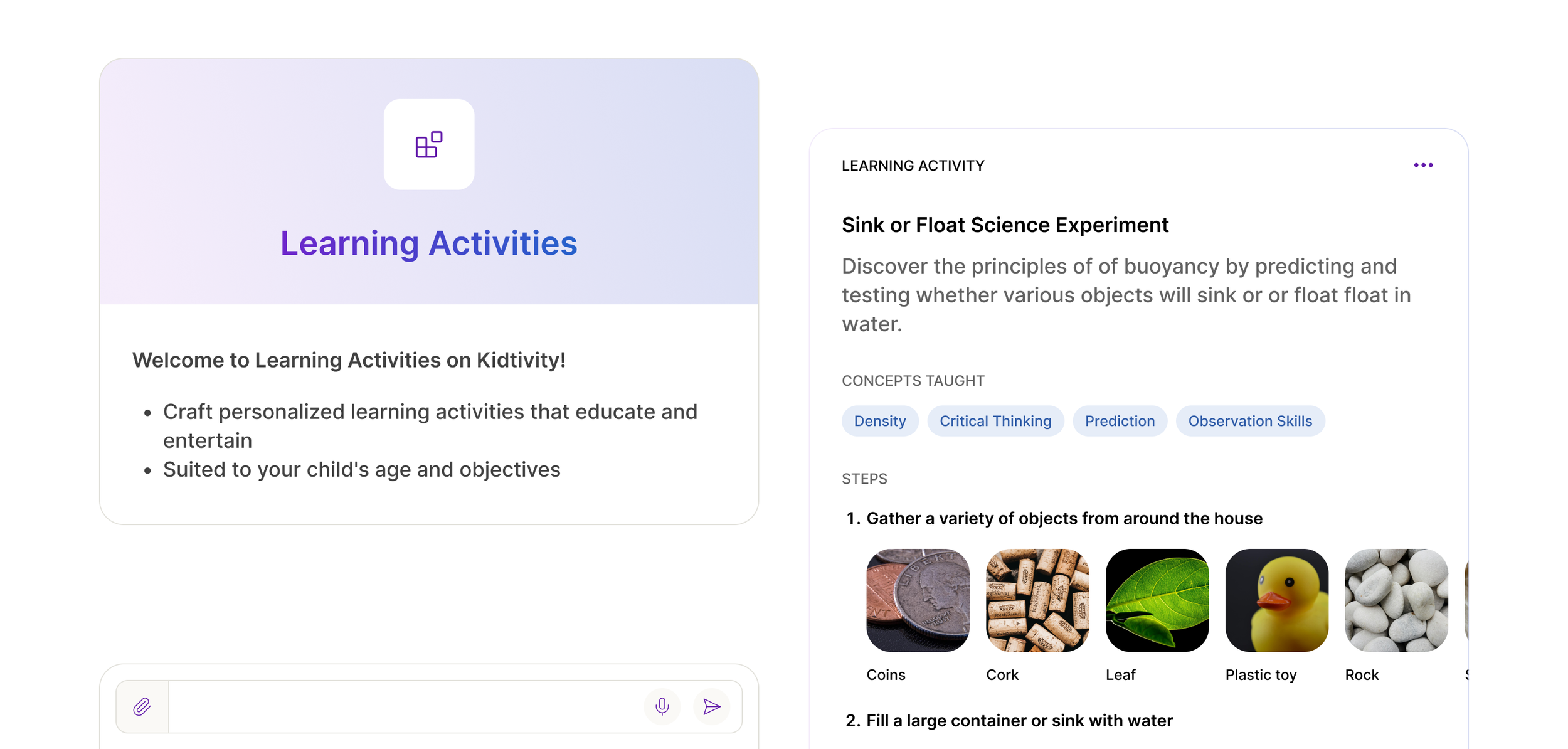
Shifting away from text-only responses, I introduced the idea of chat components to offer users an experience that was a bit more familiar.
Introduction card - leverages a familiar card layout to communicate and introduce the custom AI tool.
Conversation starters - CTA's along the top of the input, provide users with suggestions (prompts) to get started, removing the guesswork.
Reimagined input field - offers multiple ways to interact with the AI; (from left to right) attachments and voice.

AI Conversation
With the introduction of the new hybrid approach, guidance is provided, when applicable, for every response allowing the flexibility to interact with the AI in various ways and to offer context when needed.
Fixed top bar - provides a menu for easy access to archived threads, iconography serves as a waypoint for users to know where they are, and offers utility in being able to immediately start a new conversation.
Inline CTAs - depending on the reply, these buttons (starred AI suggestions) serve as a way to expand the conversation, inviting the user to dig deeper and offering relevant suggestions for optimal wayfinding.

Activity Cards
Taking the hybrid approach even further, what if we presented outputs such as activities as beautifully realized cards.
Familiarity - considering what we see and use everyday on the web, this blend of gen-AI and familiar patterns breathes new life in how information is displayed and consumed.
Figma prototype
(coming soon)
While this solution has yet to be implemented, the proprietors and I are workshopping ways to incrementally get us to this outcome. More to come.